Good to see you!
Welcome to Dulux
Terms & Conditions
Registration complete
Successfully registered, please login
Registration complete
Forgotten your password?
Please enter email address associated to your account
Change Password
Password changed successfully.
Request sent!
For more tailored inspiration, please fill in the 3 questions below.
Thanks!
Delete Account
Nature is an ideal place to draw color inspiration from. It has The light and soft colors of Summer, Bright and fresh colors of Spring, cool and icy colors of Winter, and the warm and golden earth tones of Autumn.
Here we reached into the rich colors of all Seasons to create 4 Season Palettes for your home.
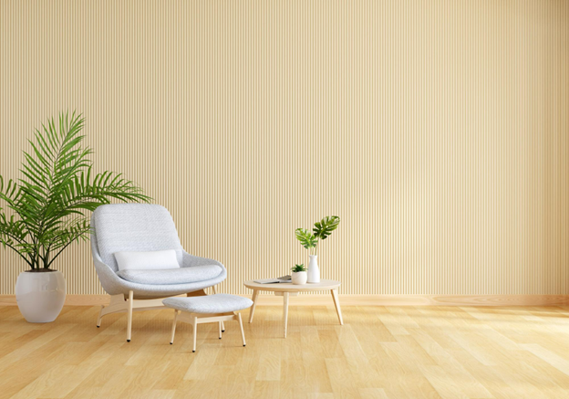
1. Summer Season
Color- Seafoam + Buttercream Yellow
Summer is all about beaches and lush gardens. Bringing summery colors to your home brings light tones that echo a cheery yet serene ambiance.
Nothing says summer like a soft beachy palette of Seafoam and muted yellow. You can lay down an area rug with pops of coral for a fresh, bold anchor and can opt for white moldings to not let any color overpower.
These airy hues promote a relaxed and open atmosphere and embody the quality of summer but easily transition between seasons.
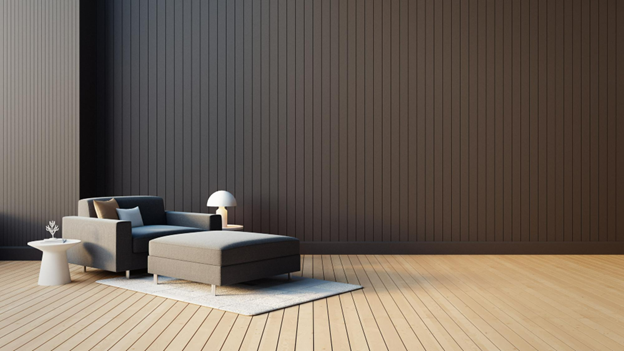
2. Autumn Season
Color - Charcoal + Brown
Autumn is associated with change. Leaves change color from green to reds and oranges, and clear white skies changes into moody gray-blues, hinting at the coming winter.
Autumn is rich in colors. It has everything from orange shades of falling leaves to Earthy tones. If you are not into bright colors, you can try warm paint colors on walls and furniture to capture that autumnal feel year-round.
This color scheme uses neutrals in slightly warmer shades to create a calm ambiance. Using browns in combination with neutrals like grey makes an Earthy combination that is flexible and easy to decorate.
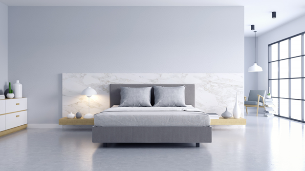
3. Winter
Color- White + Icy Blue + Grey
Draw inspiration from the weather outside and embrace icy hues in your decor. This cool color palette can be easily used in bedrooms and living spaces.
To keep the look from turning too cold and uninviting:
You can use plush textures to balance the icy look.
You can add white as an accent and different shades of blue through drapes and rugs to pop the colors more beautifully.
You can accessorize all the decorative items in shiny metallic finishes.
Spring Season
Color- White + Taupe + Pear
After winters, the bright colors of spring are a welcomed change.
Besides pastels and muted colors, neutrals can also work to bring out the fresh hue of springtime. Pear works well with sandy neutrals like taupe; when used with greige, pear gives a more muddy and yellowish look.
Its neutrality makes it such a classic color scheme, but it also gives a room a little warmth and subtle color without being excessive.
Add a new job
Add a new job
Edit a job
Delete job
Are you sure? All notes, photos and saved items will be deleted.
Save colour
Save to My Workspace
Save product
Save job